UX-UI Design Study Muncha Lunch
I choose this website because has a clumsy, monotonous layout with repeated, unevenly spaced design components. It has a number of connected features that discuss the same subject. The user must sort through a lot of information on the home page in order to get what they need because the UX flow is difficult to use, has some navigational issues, and the home menu occasionally vanishes. Due to readability issues, the UI's colour usage is inaccurate, the font is inconsistent, as well as the logo is easy to replicate in small sizes.
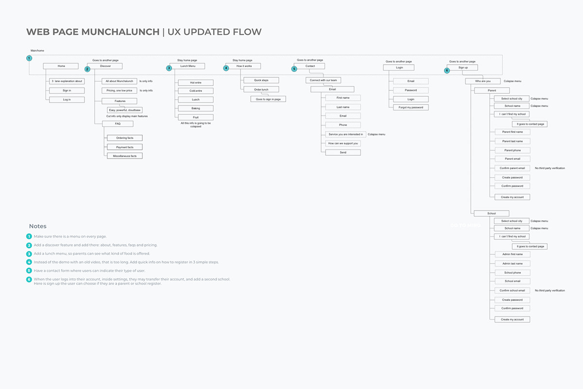
I analyzed the current flow of an app that had UX issues and updated it. In addition, I redesign some screens and chose a readable and hierarchical colour scheme because the logo and previous page both have orange, green, and yellow; otherwise, the user would not be able to recognize the brand. Given that the website is about food, I used colours for the page that reflect food. Because of its rounded edges and resemblance to the previous typeface, Proxima Nova was picked for typography; nevertheless, I created hierarchies for titles, bodies, and inputs.